Okay y'all tell me what you think.
Ok, here's what I think.
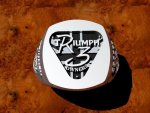
Sides look GOOD.
Top, not so much.
The "R" looks ragged and not even sized around the curve
of the loop on the "R" above the leg.
The flag is not the union jack at all.
The letters for the word Triumph aren't clear or consistent.
You can't even tell it's a "ph" hardly.
No opening in the "p" an the "h",,,,,
let's just say I hope the others turn out better.
Now that we've seen what the results are,
with "the casters version" of the union jack
and the lack of detail in the face,
I wish it just had the Triumph triangle with the 3 rivets
and the"R3" on the face myself.
The Triumph on the side looks WAY better than the face for some reason.
That's Not the way it should be,
The Face is where peoples attention will be focused,
not the clear, pretty sides.
Top is a wash out as far as I'm concerned..
I sure hope the next caster is better.
Might want to consider Not putting the flag detail on
if it's not to late to change at least one,
mine, and no black for me either.
Thanks for your efforts and let us know if this next guy is better or not.
skip